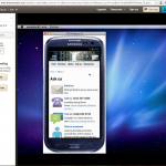
If you’re impatient, like me, you might agree that the worst part of making an online resource is testing the interface across devices and browsers. The golden rule that I tout is that all websites I make should look their best no matter how they are accessed: at any resolution, on any common mobile or desktop device, in all common browsers up to 7(ish) years old.
This is hard. Stupid hard. There are so many little quirks in how different devices/browsers choose to display even run-of-the-mill HTML, CSS, and JavaScript. So you either design super simple interfaces, or you do the legwork and make sure your code checks out across the spectrum. But how do you do that?
You can choose to own many devices (or virtual machines) and maintain a stable of old and new browser versions, which is tough but gives you the best taste of the user’s experience. Serious devs and tech companies usually have quite a collection of devices.
Your other option: you’ll have to rely on emulation software. My favorites:

BrowserStack — 60(?) minutes of free testing, then $19/mo for individuals thereafter. Test your URLs in a ton of browsers and in the most common desktop/mobile platforms. Their emulator is interactive, so you can click, scroll, and type.

NetRenderer — old reliable here. Test for free in IE 5.5–10. Paste in a URL and get a screenshot of how it looks on the screen, with the option to offset the screenshot by a number of pixels to peek past the fold.
What device/browser testing tools do you use?


This is a great Article Robin…. Thank you!