Tag: website

To scope or not to scope?

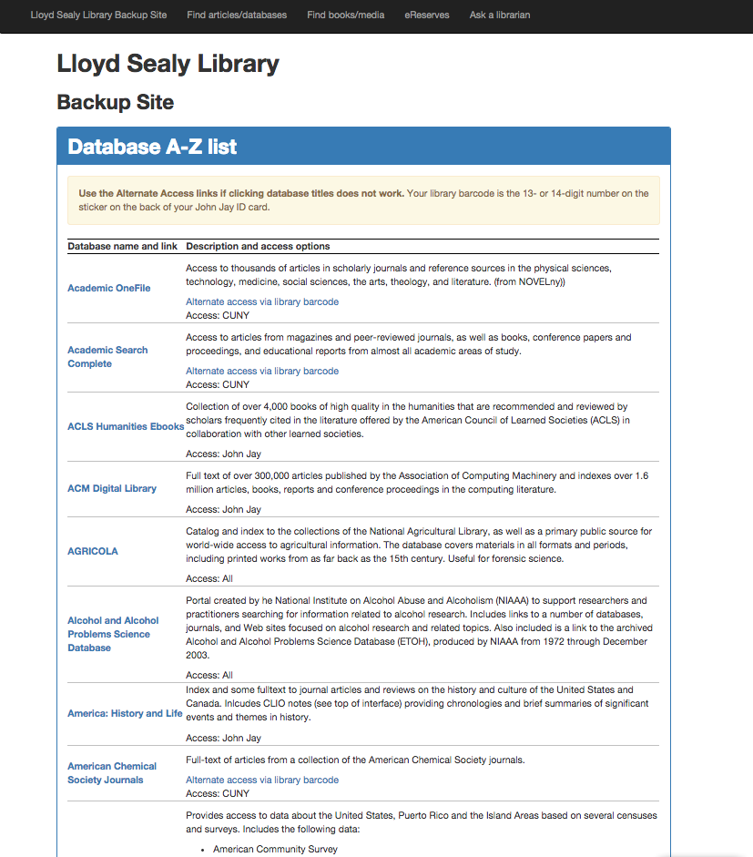
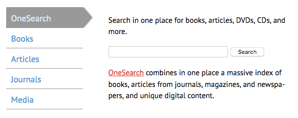
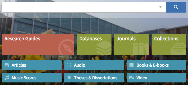
Our library homepage‘s main search area currently looks like this:

Articles, Books, Media, Journals, OneSearch

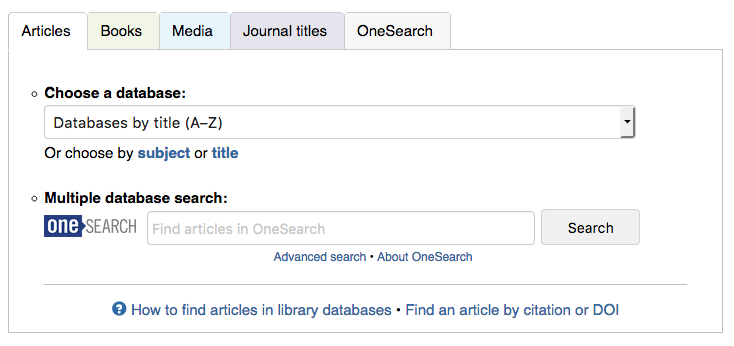
The tab box has served us well for years, but it’s about time we upgraded to something simpler and easier to use. We plan to give our entire website a nice update over the summer, mostly subtle aesthetic changes, but with a big search box upgrade. We’re currently in a discussion about whether to keep the general idea of tabs (expecting users, mostly students, to know ahead of time whether they’re looking for articles or books) or to present one big OneSearch box (à la Google).

TL;DR: We plan to present the big-box search that students say they love, but include Article/Book/Media scopes as a didactic hint and visual cue. This post looks at how other libraries present scope options, if any.

Our website analytics tell us that students mostly use the scoped options. In the tab box, the 4 highest-use options, in order: database dropdown menu, OneSearch box scoped to articles, OneSearch box scoped to books, and OneSearch box non-scoped. This is strongly influenced by the options that we present to the user.

Do we keep these scopes in our redesign? Students compose most of our users. On the one hand, they’ll probably say they’d prefer a big search box, like Google and Amazon. On the other hand, when they approach the reference desk, they’ll usually say, “I’m looking for a book called…” or “I need to find articles on…” So what do we do?

Step 1: Let’s see what other libraries are doing.

Search UIs within CUNY

Just about every CUNY defaults to the same discovery layer, OneSearch (aka Primo, the web-scale discovery system from Ex Libris), along with offering a handful of databases and other resources that are campus-specific. OneSearch has the same scope options for every CUNY campus.

Define Your Search dropdown

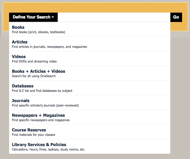
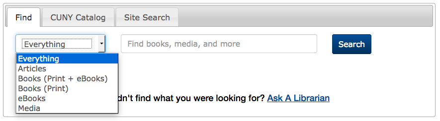
The Newman Library at Baruch College requires the user to select a scope first before they can type in the search box. Some of these options are links (like Databases) rather than ways to scope the search.

Onesearch, Books, Databases, Journals

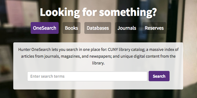
Hunter College Libraries default to OneSearch, but offers faded tabs for optional scoping. Media (videos, mostly) isn’t a scope they offer.

OneSearch, books, articles, journals, media

The College of Staten Island Library does the same as Hunter, but with vertical tabs.

OneSearch - everything, articles, books, books (print only), ebooks, media

The Schwerin Library at City Tech has a dropdown of scopes, but defaults to a non-scoped OneSearch. Interestingly, there are three options for books: print, ebooks, and both. (Here at John Jay, most students seem to prefer print books, so they’d probably appreciate this option.) Databases are linked outside of the tab box.

OneSearch - Search books, articles, media and more

Brooklyn College Library offers just one search box, for a non-scoped OneSearch search, but provides text links to CUNY+ and databases below.

In fact, all CUNY libraries’ approaches to OneSearch were tabulated and analyzed by Nora Almeida, Helen Georgas, and Alexandra Hamlett (all CUNY librarians) for their “The Cosmography of Discovery: Integration, Student Perceptions, and Information Design” presentation at the ER&L 2017 Conference. (If you/your institution has an ER&L Conference login, you can watch their presentation slides + audio — highly recommended!)

In looking at the above sampling, I also notice that John Jay is an outlier for offering a shortcut list of “popular” databases, rather than directing users to the full list of databases, which can number over 100. This campus is pretty tied to that list of popular databases, and I think it’s a good idea to keep that shortcut. (Even if it might diminish the use of the “non-popular” databases.)

Other interesting search UIs

Outside of CUNY, here are a few of my fave academic library websites:

Articles, Books and media, journals

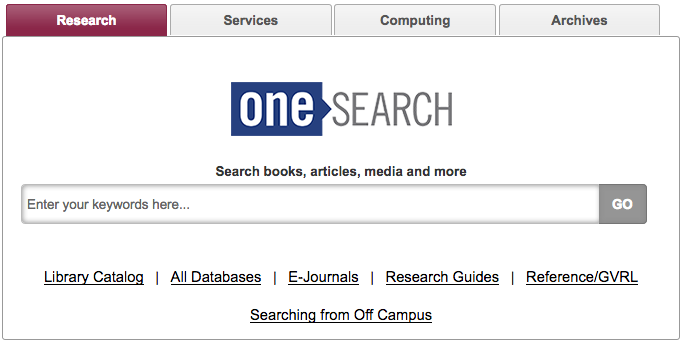
The University of Illinois—Chicago Library search box is currently the above, but apparently they’ll soon be moving to a “Search Everything” bento-box search UI. (I wonder if it really is “everything”?)

The look of the tab box is very clean and technical, mirroring the look of the UIC site as a whole.

A 2017 Code4Lib article, “Participatory Design Methods for Collaboration and Communication,” by Tara M. Wood and Cate Kompare, goes behind the scenes for the UIC website redesign. It’s a fantastic article.

big search box + research guides, databases, journals, articles, etc

The BYU Library has an unlabeled search box for their discovery system (with an advanced search option subtly indicated), and includes lovely buttons below advertising specific resources and majorly highlighting their libguides.

big search

The library at my alma mater, Brown, just has one big search box in the middle of the screen. It’s actually unusual how prominently that box is placed. They’ve put other options below the fold:

search library resources list

Trying a new tab box

So it seems that most other libraries default to an “everything” search, but offer scope options. That seems like it might be a good solution for us, too, but John Jay students are a unique group. What will work for them?

Here at John Jay, I’m now playing with two mocked-up widget boxes. Here’s the first, strongly inspired by UIC:

Three main tabs: OneSearch, Databases, Journal Titles

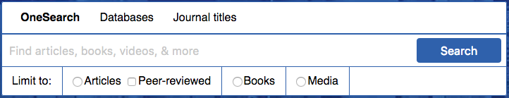
Defaults to non-scoped OneSearch, as most other CUNYs seem to do, but gives the option for Articles (and peer-reviewed articles), Books, and Media. This, to me, seems like a natural next step: Presenting the big-box search that students say they love, but prominently displaying scope options as a didactic hint and visual cue. This gives the user a hint as to what OneSearch includes. Will students actually use these scopes? We’ll have to test to find out.

One big issue with the “peer-reviewed” checkbox is that OneSearch can only narrow results down to articles published in peer-reviewed journals, but not necessarily peer-reviewed articles, so reviews and columns will show up in the results. We discussed this in our Web Committee, and this is apparently a problem with pretty much all discovery systems, so… Oh, well, we’ll just live with that? I know many students will appreciate this kind of filter, even if it’s problematic. We can use explanatory hover text.

Another issue: “Articles” is distinct from “newspaper articles” as a scope in OneSearch. To sort-of-solve this, I put more explanatory hover text over Articles. (Technically, you can cobble together multiple after-search facets, which Baruch does, but then when the user changes their keywords and searches again, after-search facets disappear, which we didn’t like at John Jay. So we stick to pre-search scopes, which can’t be combined, but do stick around after a keyword revision.)

This tab box includes Databases as a top-level tab:

Databases tab: dropdown menu, Choose by title or subject, Find by citation

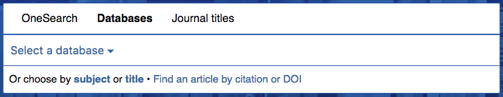
Database-specific searching is still how we teach some classes and how many students and faculty alike prefer to search. The tab includes the Popular Dropdown menu, which also directs users to browsing databases by title/subject (duplicating the links below the dropdown menu).

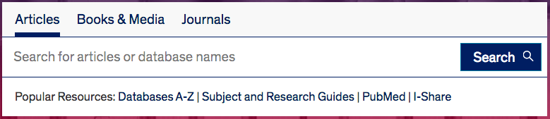
Another tab box I messed around with, more similar to our current one, and inspired by Baruch:

Articles / books / media / OneSearch, simple box

The dropdown menu opens to:Articles, Books, Media, OneSearch

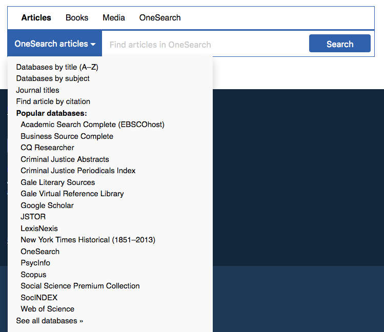
Here, OneSearch is the default search for every tab, and only Articles has any other option. Inspired by Baruch, I faked parts of the dropdown menu — that is, clicking JSTOR won’t present a JSTOR-only search box, it will just open JSTOR as a link.

In a recent Web Committee meeting with other John Jay librarians, we agreed to pursue the first tab box, but perhaps with refinements. Next week, we’ll do some guerrilla usability testing outside the cafeteria so that we can see whether students find the new tab more or less usable. Stay tuned!

Bootstrapping an emergency library backup site

TL;DR: I Bootstrapped lib.jjay.cc, a Library backup site with the links to online resources, hosted on my personal webspace with an official-ish domain name.

Over this past weekend, the John Jay College network went down. It was pretty serious: no one off-campus could access the main College website for a while, and even when that went back up, the Library website was down for about half the weekend. Yikes!

I had done two very lucky things earlier in the month:

I’d bought jjay.cc on a whim. I’d proposed that the John Jay web department buy it as a shortlinker, and when they showed no interest, I bought it myself ($10, why not!) and have been using it as a way to shortlink Library content. (More on customizing Bit.ly later.) It looks official-ish, and no one has to know it’s on the same webspace as my other goofy websites.

I owe a shout-out to Val Forrestal, who once gave a talk at METRO about setting up an emergency library site after getting hacked. I’d always thought, hey, I should do that sometime, just in case. And then, on Saturday, the flurry of emails about the campus-wide network issues seemed dire, and it was time. So I whipped up the Lloyd Sealy Library Emergency Backup site at lib.jjay.cc:

library backup site screenshot

With a second page for the database A-Z list:

database a-z list

How I made the site

I made a basic Bootstrap template. “Bootstrapping” just means copying and pasting various parts of the Bootstrap framework. I used the navbar, panels, and tables. What’s nice is that everything is already styled and mobile-friendly. I only had to work on two HTML files.

The on-campus network was still functioning, thank goodness, so I VPN’d in to copy the HTML from the normal library site. No need to do anything new when all the code’s already done. EZproxy was also intermittently inaccessible, but luckily, students can also use their library barcodes to log into databases that CUNY subscribes to. We noted that fact on the backup site.

I use Dreamhost as my web host and domain registration service. I created a subdomain, lib.jjay.cc, and used my usual FTP login with Transmit to upload the files. I also uploaded a restrictive robots.txt file so that this backup site would never show up on Google.

It took me under an hour to set it up. We publicized the backup site on social media and got a few grateful responses. We were in touch with the John Jay webmaster about changing the link to the library on the main college site, in case IT told us the network issues would take much longer to resolve. In the end, we just waited it out. And now we’ve got a backup site, should anything go wrong with the network or our servers. (Knock on wood.)

Takeaways: make a stripped-down version of your library website and keep it somewhere safe, somewhere you can access it on- or off-campus. And if you don’t mind spending an extra $10/yr, it might be worth it to buy an official-looking but unofficial domain name, just in case.

Gentle SEO reminders

I know this dead horse has been beaten. But here are some reminders about things that slip through the cracks.

Every once in a while, google the name and alternate names of your organization and check the universal (not personal) results.

Google results page: before (Note: this is my best approximation. Was too distressed to take a screenshot)
I did this a while ago and was shocked to discover that the one image that showed up next to the results was of someone injecting heroin into their arm! Oh my god! As it turned out, one of our librarians had written a blog post about drug abuse research and that was a book cover or illustration or something. None of us knew about it because why would we google ourselves? Well, now we google ourselves.

Are you the business owner?Claim your location on Google+.

Click the “Are you the business owner?” link (pink in screenshot at right). You’ll have to verify before you can make a basic page. But in doing so, you will have some control over the photos that show up next to the place name. For example, I posted some of my better library photographs to our Google+ page, and they soon replaced the heroin arm.

Demote sitelinks as necessary.

Sitelinks are the sub-categories that show up beneath the top search result. In our case, it’s things like ‘Databases’ and ‘How to find books’ — appropriate for a library. But there were also some others, like ‘Useful internet links’ (circa 2003) that were no longer being updated, so once verified as webmasters, we demoted them.

Check out your reviews.

Since place-based search is the thing now, you’d better keep tabs on your Foursquare, Google, and other reviews pages. For one thing, it’s great to identify pain points in your user experience, since we are now trained to leave passive-aggressive complaints online rather than speak to humans. Example: our Foursquare page has a handful of grievances about staplers and people being loud. Okay, so no surprise there, but we’re trying to leave more positive tips as the place owners so that people see The library offers Library 101 workshops every fall when they check in, not Get off the damn phone! (verbatim).

Add to your front-page results.

If there are irrelevant or unsatisfactory search results when you look up your organization, remember that you have some form of control. Google loves sites like Wikipedia, Twitter, YouTube, etc., so establishing at least minimal presences on those sites can go far.

Meta tags.

Okay, so this is SEO 101. But I surprised myself this morning when I realized, oh dear, we don’t have a meta description. The text of our search result was our menu options. Turns out Drupal (and WordPress) don’t generate meta tags by default. You’ll have to stick them in there manually or install a module/plug-in. Also, you’ll want to use OpenGraph meta tags now. These will give social sites more info about what to display. They look like this:

<meta property="og:title" content="Lloyd Sealy Library at John Jay College of Criminal Justice"/>
<meta property="og:type" content="website"/>
<meta property="og:locale" content="en_US"/>
<meta property="og:site_name" content="Lloyd Sealy Library at John Jay College of Criminal Justice"/>
<meta property="og:description" content="The Lloyd Sealy Library is central to the educational mission of John Jay College of Criminal Justice. With over 500,000 holdings in social sciences, criminal justice, law, public administration, and related fields, the Library's extensive collection supports the research needs of students, faculty, and criminal justice agency personnel."/>

All right, good luck. Here’s hoping you don’t have photos of explicit drug use to combat in your SEO strategy.

P.S. If you use the CUNY commons, try the Yoast WordPress SEO plugin. It is really configurable, down the post-level.

Device and browser testing tools

If you’re impatient, like me, you might agree that the worst part of making an online resource is testing the interface across devices and browsers. The golden rule that I tout is that all websites I make should look their best no matter how they are accessed: at any resolution, on any common mobile or desktop device, in all common browsers up to 7(ish) years old.

This is hard. Stupid hard. There are so many little quirks in how different devices/browsers choose to display even run-of-the-mill HTML, CSS, and JavaScript. So you either design super simple interfaces, or you do the legwork and make sure your code checks out across the spectrum. But how do you do that?

You can choose to own many devices (or virtual machines) and maintain a stable of old and new browser versions, which is tough but gives you the best taste of the user’s experience. Serious devs and tech companies usually have quite a collection of devices.

Your other option: you’ll have to rely on emulation software. My favorites:

Testing an Android device (click to enlarge)

BrowserStack — 60(?) minutes of free testing, then $19/mo for individuals thereafter. Test your URLs in a ton of browsers and in the most common desktop/mobile platforms. Their emulator is interactive, so you can click, scroll, and type.

Testing IE8 (click to enlarge)

NetRenderer — old reliable here. Test for free in IE 5.5–10. Paste in a URL and get a screenshot of how it looks on the screen, with the option to offset the screenshot by a number of pixels to peek past the fold.

What device/browser testing tools do you use?

Site icons

iconsI just made a whole bunch of new icons for our website using the Flat Design Icon sets #1 and #2 from Pixeden. They’re free, royalty-free, and attribution-optional. Each set of 16 icons (including more than the library-oriented ones above) comes bundled in a PSD, so you can change the colors to suit your site. In our case, blue blue, blue. Inspiration? The Flat Design look popularized by Microsoft and Google. 

See them in action on our Resources for Students and Ask us pages.

PS. The phone and person were traced from various wingdings, which is why they’re not quite so nice-looking, but I assigned the same Layer Style to them so they’d match