I’ve previously posted on the 70 lines of CSS I used to upgrade the look of John Jay’s LibGuides. They look better, but still not super great — still very LibGuidesy. We had migrated the John Jay website over to Drupal 7 because the CMS makes editing easy for all the librarians, but we have so much content on LibGuides — which get 5,000+ views per week — that it would be silly, at this point, to try migrating the content and dealing with hundreds of links to redirect. It’s a system all the librarians know well and can use with ease; students navigate them fine; and I haven’t found a module with the granular organization scheme LibGuides provides. It does take some TLC to liven up their appearance, though.
I’ve taken a look at some lovely LibGuides redesigns at VCU and UMich, as well as Stanford’s LibGuides departure.
VCU
Searching for ‘libguides’ on GitHub yields a handful of results, including this nice test design from VCU Libraries (whose homepage I’ve been admiring, too):
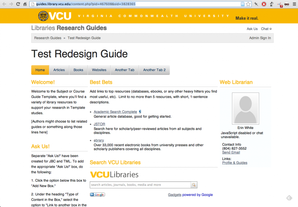
Of note:
- Much airier, thanks to the blank white background
- Content is not boxed in and thus looks slicker (though could use some more padding)
- The Apple-y tab solution looks nice up top (provided there aren’t multiple rows of tabs)
- The type nicely arranges the content hierarchy, though within the LibGuides system there’s no getting around the fact that each page has 3 big titles (VCU / Library Research Guides / Test Redesign Guide) and at least 3 further levels of content organization (tab, box, paragraph/list).
I think they’ve done some finessing to the mobile view, too. (LibGuides currently detects browsers in order to present the mobile view automatically, making responsive design impossible.)
Their custom CSS is 320 lines long and available on GitHub.
UMich
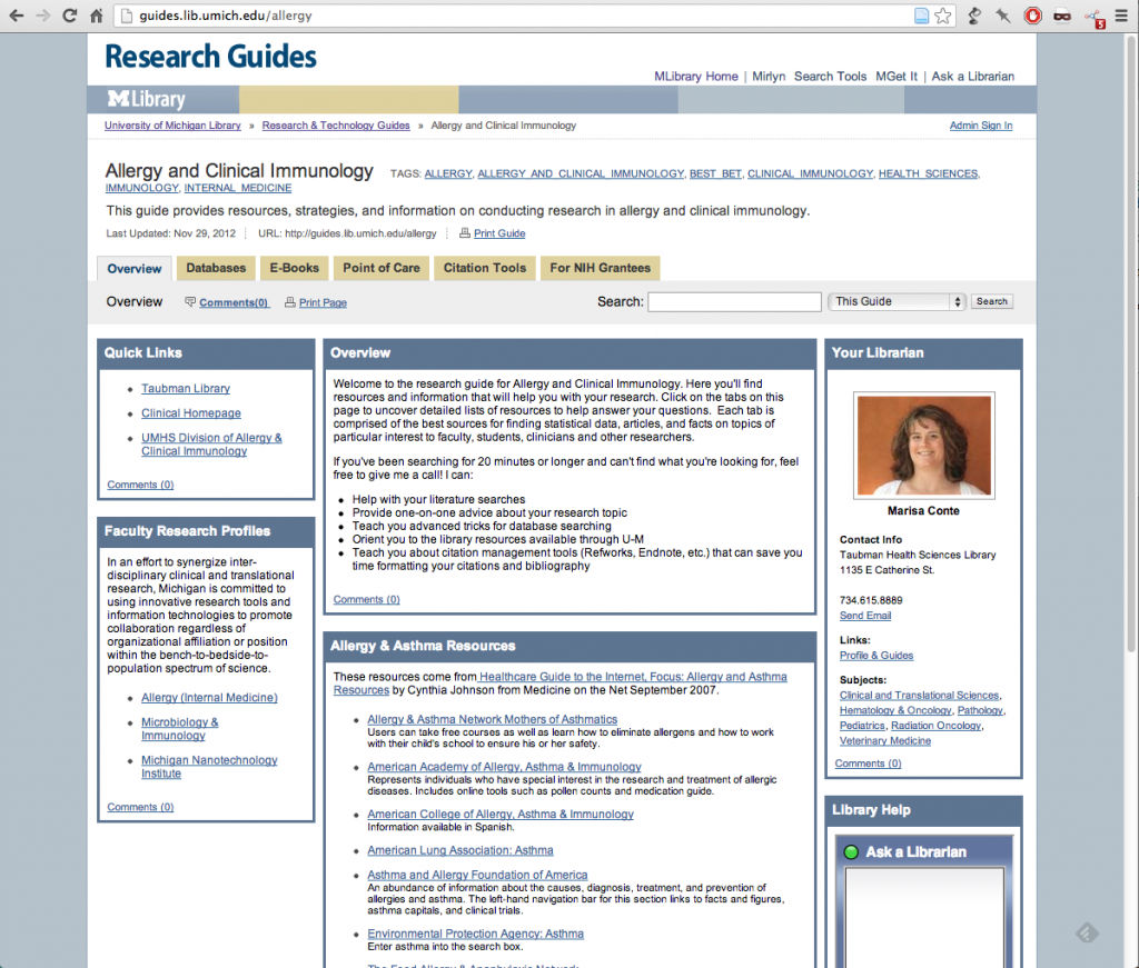 Like us, University of Michigan libraries have stripped out even the mere memory of LibGuides’ gradients. Instead, they’ve opted for a really nice flat look with a restrained, Martha Stewart-approved color scheme. Still very LibGuidesy, but bearable, branded, and familiar. It’s about 220 lines of custom CSS. (If you’re looking to get inspired by any custom job on LibGuides, the custom CSS is actually just embedded at the end of the HTML header.)
Stanford
Stanford is phasing out LibGuides. Instead, the library website offers topic guides and course guides, all within the customized Drupal CMS. They have a blog post from January 2012 briefly describing the process of designing their new guides for six personas. I’m not sure if they’re using a specific module or if it’s simply a content type.
Their LibGuides are actually still online and apparently being used, but they also migrated content over. So some appear to be duplicated, and some links in the new topic guides still lead to the old LibGuides. Not sure what’s going on. (XML export?) Anyway, here’s one example:
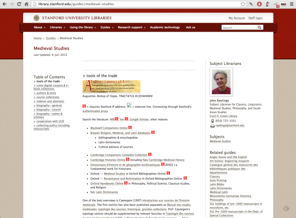
Instead of a line of tabs at the top, there’s a table of contents on the left, which makes more sense yet is somehow less visible. The function of the ToC links wasn’t immediately clear to me the way that skeuomorphic tabs are. On the plus side, all ‘tabs’ load at once (see source code) — so switching between them doesn’t require loading another page.
The user’s experience in the new guide template can vary widely. In exhaustive guides, the content of each tab can fast approach Wall of Text status, as in the Medieval Studies topic guide above. But others, like the Tel Aviv History guide (gosh, they get specific), offer digestible pages punctuated with images and section breaks.
One thing I haven’t touched on is the landing page for LibGuides. Ours looks a bit messy (“Display ALL the information!”), but our in usability tests, students seem to want to scan/hunt rather than click deeper into subject areas or use the search box, surprisingly. Still, should we want to tidy up, all three libraries mentioned exemplify excellent categorization and display of their guides.
Any other good examples?