PLEASE NOTE: As of 2015, this blog post is outdated! It discusses customization for LibGuides 1.0, which is no longer supported! If you have LibGuides, you should be on LibGuides 2.0, and this post is not useful to you.
—
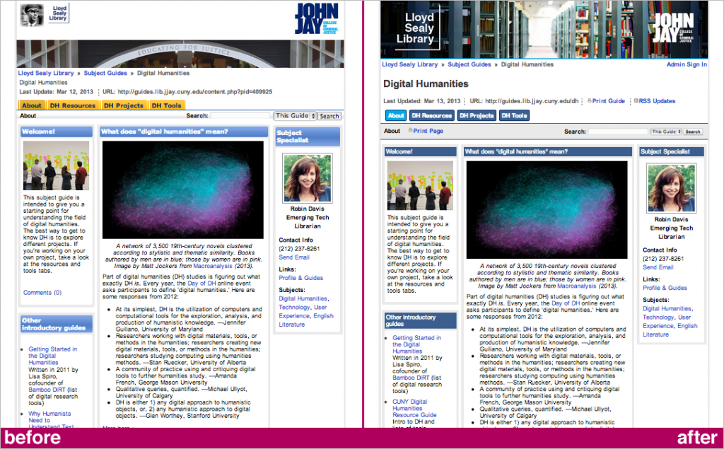
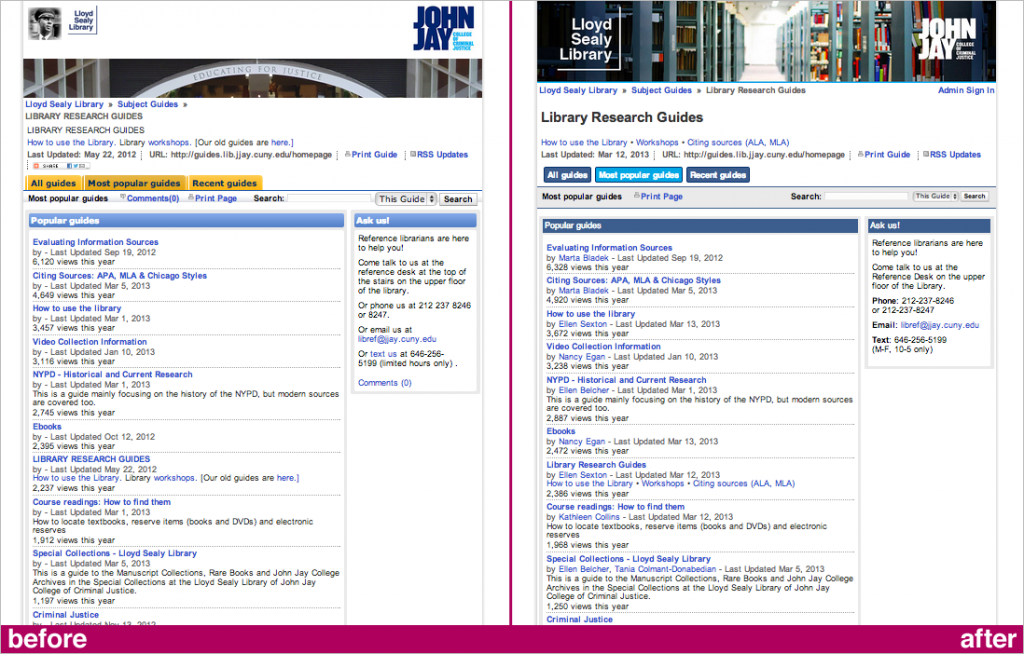
I’ll be honest: I didn’t know what LibGuides were until I was well into my library & information science graduate program, and at first I thought they were pretty dorky since they looked so dated. But I’ve since come around, and overall they’re great — easy to create, easy to edit, and fairly reliable as software. The default skin could use some work, though. We recently updated the look of John Jay’s LibGuides (we call them Subject Guides) and I thought I’d show you how we did.

A more modern look for your LibGuides:
- If you’re an admin, get to the Admin stuff » Customize » Look & Feel page (admin_lookfeel.php)
- Ignore the tab options and color swatches
- Banner options:
- A static image, 985px wide, that will automatically link to your main library page
- Custom Header Code in HTML: use if you have multiple images, a menu bar, or other complex items. Note that this code doesn’t actually go within <header>
- Both: not recommended, looks messy. Note that the System Banner will appear after the Custom Header Code. (See ‘before’ image above.)
- Custom JS/CSS code: this is where you can customize how the whole page looks, as it overrides the system CSS. You can write your own using a template I made, or the code I used:
 <style type="text/css">

.headerbox h2 {font-weight:normal;font-size:14px;font-family:helvetica,arial,sans-serif;color:#ffffff;} /*headers for boxes of content*/

.headerbox {background-image:none;background-color:#3c5e8e;}

.headerbox h2 a {color:#ffffff;}

#tabsI, #tabs12 {font-size:14px;font-family:helvetica,arial,sans-serif;} /*tabs at top of page, below guide title, above page content*/

#tabs12 {padding-bottom:5px;border:none;}

#tabs12 a, #tabs12 a span {background-image:none;}

#tabsI a span, #tabs12 a span {background-color:#3c5e8e;padding: 5px 6px;border-radius:5px;margin:2px;border:1px solid #012d6b;}

#tabsI a span:hover, #tabs12 a span:hover {background-color:#00a7e5;}

#current a span {background-color:#00a7e5;} /*tab of the page you're on*/

.dropmenudiv a:hover {background-color:#00a7e5; color:#ffffff;} /*for sub-pages*/

.dropmenudiv {font-size:12px;font-weight:normal;font-family:helvetica,arial,sans-serif;margin-top:-5px;}

.stitle {background-image:none;background-color:#eaeaea;border-bottom:1px solid #3c5e8e;border-top:1px solid #3c5e8e;padding:10px;} /*band below tabs, with title of page and search box*/

.guidetitle {font-size:30px;font-weight:bold;}

.box_comments, .icomments, #addthis_button {display:none;} /*all references to comments hidden; Share This box hidden*/

.guidetags {display:block;margin:10px;}

#guide_header_title, #guide_header_title h1 {display:block;margin:20px 0;}

</style>
Things this code will do:
- Take out all references to Verdana and replace with Helvetica; make all text easier to read with increased size and fewer instances of bolded font
- Where you see display:none, that’s mostly where we’re hiding all references to comments and overriding the circa 2002 gradient look of which LibGuides is so fond. Gradients can be gorgeous, but use them wisely, everyone.
- The colors in this custom code are blue and grey — be sure to color-match to your library site. For easier color-matching, refer to screenshots and find/replace these hex codes:
- #012d6b is navy blue (border of buttons)
- #3c5e8e is medium blue (buttons and box titles)
- #00a7e5 is bright blue (active and hover buttons)
- #eaeaea is light grey (band where search bar is)
- #ffffff is white (button and box title text)
- Make the tabs at the top of the page into buttons with rounded corners (flat color). Guides with multiple tabs may find that by default the tabs stack up on top of each other unattractively; buttons make slightly more sense and look better.

That’s all we did. Small steps, big improvement!
Update 2013-03-18: A promising (or ominous?) tweet from Springshare, makers of LibGuides:
Even more options on the way.Follow us & stay tuned. RT @robincamille: Make your LibGuides look better: emerging.commons.gc.cuny.edu/2013/03/easy-l…
— springshare (@springshare) March 18, 2013
Update 2013-03-25: There was a good question in the comments about how guides with multiple rows of tabs (many pages) look. Here’s a portion of a screenshot (click for larger):
Compare to rows of default tabs (click for larger):
Buttons > Tabs.
PLEASE NOTE: As of 2015, this blog post is outdated! It discusses customization for LibGuides 1.0, which is no longer supported! If you have LibGuides, you should be on LibGuides 2.0, and this post is not useful to you.


Aloha,
I was just wondering how to remove the lines that appear between the buttons when using this code. Any ideas on what to change? Thank you for your time. Have a wonderful afternoon!
TTFN,
Jenny
Nice clean modern look — I like it. We’re looking at a website redesign in the near future, and it would be the perfect time to freshen up our LibGuides.
Thank you so much for sharing!
I was wondering how you handle those LibGuides that have more than one row of tabs; those guides now have one or more rows of buttons.
This is super helpful! Going to look into making some of these changes at my library.