February 5, 2015 2:47 PM Edited to add ScienceScape as a way to format your data without having to use Python
February 6, 2015 1:22 PM Edited to add instructions for cleaning index keyword data
Here’s what I made this morning:
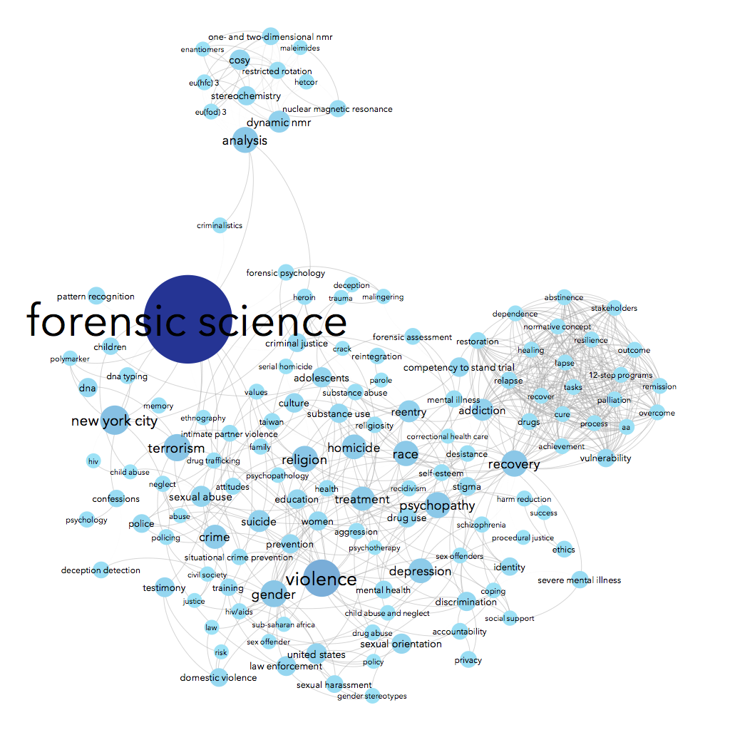
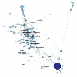
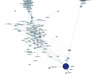
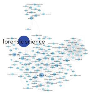
Using data from Scopus about some of the science & social science publications written by John Jay College-affiliated authors, we can see connections between the top keywords listed for each article. For instance, John Jay faculty & grad students often write about forensic science — no surprise there, we have a renowned forensic science department! People who write about forensic science are often also writing about suicide, weapons, DNA, and/or New York City in the same article. Essentially, I made a word cloud that connects keywords that co-occur.
Perhaps you’d like to do this for your institution, too!
Gephi topic map tutorial
You will need:
- Access to Scopus through your institution
- Gephi (no experience necessary)
- Plain-text editing program like TextWrangler (familiarity with regular expressions helpful)
- Optional: Python 2.7 (some experience necessary)
Time estimation: 1.5-4 hours, depending on your familiarity with the above and on how much Gephi playtime you give yourself.
Step 1. Get the data.
Many databases will let you export some index data. For this, I used Scopus, a subscription database that offers access to publications in life sciences, social sciences, health sciences, and physical sciences. (See their breakdown of content coverage.) Other possible data sources include Ebsco (export limited to 100 queries at a time) and Web of Knowledge (export limited to 500 queries at a time).
Scopus offers search by affiliation:

After which you’ll see a very nice breakdown of what they’ve indexed from your institution:
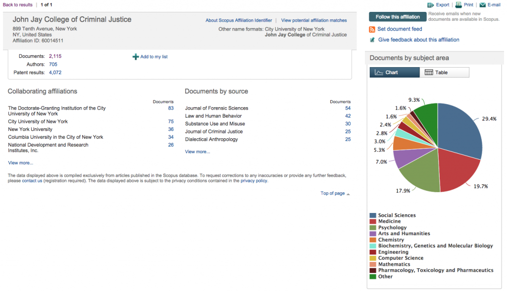
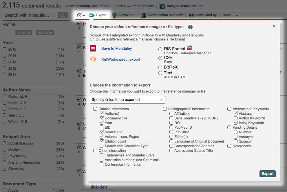
For the data export we’ll use today, what you’ll want to click here is the number after “Documents:,” which you’ll see is the only visited link in the screenshot above. Then, you get to click the “Select all” checkbox and open up the “Export” pane. Choose “CSV” as your filetype and “Specify fields to be exported,” after which you’ll choose what you want.
Scopus only lets you export 2,000 records at a time. If you have more than 2,000 for your institution, you’ll have to use the pager and cobble together the full data that way. It helps to toggle by date so you know where to stop and start. Luckily, there were only 115 other documents for John Jay, so this wasn’t too strenuous for me.
Your CSV(s) will download. They will look like this:
Which is great fun! There is so much data here! But even though we’re only focusing on one column today, we can do a lot of cool stuff with this.
Data caveats:
- Data represents some publications that are in the sciences that Scopus happens to index; not all of your faculty’s science pubs will appear here, and non-science pubs won’t be here
- Not all of it is clean — some fields are mysteriously blank
- Dates may be limited (e.g., 1960s on)
- We’re looking at index keywords. Only 900 of the 2100 publication records I downloaded included a list of index keywords, so we’re looking at a sample of a sample of the complete data.
Step 2. Clean and arrange keyword data
Step 2.1. Remove unnecessary keywords.
Copy and paste the index keywords column into TextWrangler or your favorite plain text-editing program. Each line represents one article’s keywords, as assigned by Scopus, probably algorithmically. Here’s an example line:
‘adult’,’article’,’female’,’human’,’male’,’middle aged’,’psychological aspect’,’psychological rating scale’,‘psychology’,’schizophrenia’,’self concept’,’social stigma’,’treatment outcome’,’vocational rehabilitation’,‘Adult’,’Female’,’Humans’,’Male’,’Middle Aged’,…
Some of these keywords, which I’ve underlined, are not necessarily what you’d consider topic keywords. They describe the type of study — likely the authors were talking about how schizophrenia affects middle-aged adults. Other type-keywords you’ll see over and over again include clinical study, legal aspect, rat, rats, mouse, mice, age factors, conference paper, etc. They’re not really topic-keywords. These type-keywords occur so often that they’ll throw your topic map off.
In Gephi, you could exclude the X most frequent keywords, which will include many of these, but you also run the risk of excluding actual topic-keywords with a high frequency you’d want to keep, like psychology. You could look at all the keywords and come up with your own list of type-keywords to ignore, and certainly looking at your Gephi output later on you’ll see more that you want to exclude. I used this insane-looking regular expression to replace type-keywords with nothing:
(; .*?((studies)|(study));)|(; methodology;)|(; adult;)|(; child;)|(; .*?article;)|(; review;)|(; united states;)|(; humans?;)|(; priority journal;)|(; male;)|(; female;)|(; research;)|(; child;)|(; adolescent;)|(; middle aged;)|(; methodology;)|(; questionnaires?;)|(; .*?interviews;)|(; .*?aspect;)|(; young adult;)|(; nonhuman;)|(; reproducibility of results;)|(; reproducibility;)|(; conference paper;)|(; .*? scales;)|(; interview;)|(; normal human;)|(; .*? report;)|(; risk assessment;)|(; risk factor;)|(; follow up;)|(; animals?;)|(; cohort analysis;)|(; analysis of variance;)|(; .*? index;)|(; mouse;)|(; time;)|(; interview, .*?;)|(; model;)|(; .*? feature;)|(; data collection;)|(; regression analysis;)|(; quality control;)|(; short;)|(; cluster analysis;)|(; age( factors)?;)|(; rats?;)|(; animals?;)|(; analytic methods?;)|(; support, .*?;)|(; aged?;)|(; informed consent;)|(; ((age)|(time)) factors;)|(; infants?;)|(; human relations?;)|(; child, preschool;)|(; life change events;)|(; unclassified drug;)|(; computer simulation;)
You will want to run several variations of the above to make sure that line-starting and line-ending keywords are taken care of, too, e.g. |(\ncluster analysis;) and |(; cluster analysis\n). I couldn’t figure out how to make one grand regex so I just ran multiple.
Now, you may also notice that some of the keywords in that example list above had case-sensitive keywords, like adult and Adult. You might want to take a look and see if important keywords are being repeated in different cases, like psychology; Psychology. If left alone, they’ll count for double, which could also throw you off.
Step 2.2. Arrange data the Python way: Using Python to generate the source data for the graph is an easy solution if you’ve got basic Python skills. This gives you control over the data, while getting to know what exactly the data comprises (a very responsible practice).
We need to get data that looks like this, from an article’s index keywords list…
Crime; Fisheries; Case-control; Crime Prevention
…into a CSV that looks like this:
‘Crime’,’Fisheries’
‘Crime’,’Case-control’
‘Crime’,’Crime Prevention’
‘Fisheries’,’Case-control’
‘Fisheries’,’Crime Prevention’
‘Case-control’,’Crime Prevention’
That is to say, many articles have a list of index keywords (keywords provided by Scopus, presumably), and each keyword in the list needs to be connected to every other keyword attached to the same article, line by line. And you’ll need to do this for every article’s keywords list.
The easiest way I know how to do this is in Python. First, copy/paste the index keywords column into a TXT file. Then you can use this script I wrote.
You’ll get a CSV output. Mine is 500 Kb and 13,000 lines long.
Open it up into a plain-text program to check it out and make sure the line breaks, commas, quote marks are all in place. You might want to make all the words lowercase, too.
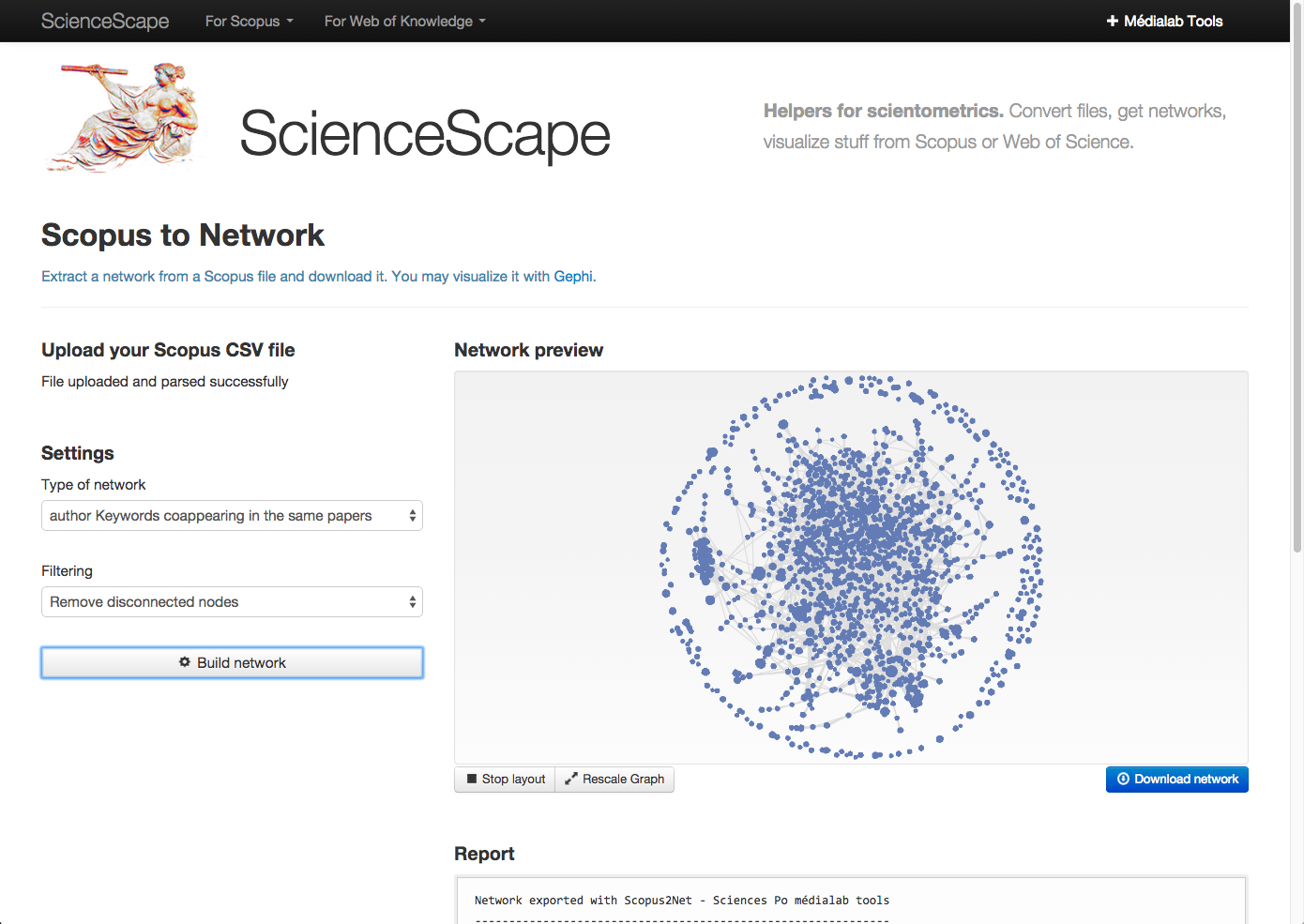
Step 2.2. Arrange data the ScienceScape way: a savvy group of Sciences Po researchers have created ScienceScape, a way to get Scopus data into Gephi-usable form, right in your browser.
Choose “author keywords coappearing in the same papers” and “remove disconnected nodes” (no orphan keywords). “Download network” will download a .gexf (graph file).
Thanks to Mathieu for leaving a comment about this wonderful tool!
(PS. You can also watch a really wonderful video tutorial for using Scopus data with Gephi to create a network of an institution’s researchers. This video was how I first learned this cool stuff was even possible.)
Step 3. Open up your CSV or .gefx file in Gephi.
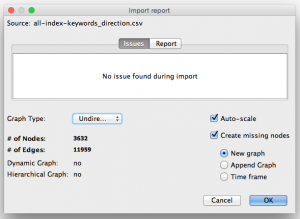
Download Gephi, the free, open-source data visualization program. Gephi is great for network visualizations. Select File » Open and choose the CSV or .gefx file you just generated. Choose “Undirected” as graph type. (This means that given a pair of keywords like ‘Fisheries’,’Case-control’, we don’t consider Fisheries to be the source and Case-control to be the target. We don’t want lines with arrows in the graph, just regular connector lines.)
There are three panes in Gephi:
- Overview, where you play with the graph layout
- Data Laboratory, where you clean and sort data, if needed
- Preview, where you adjust what your exported graph will look like
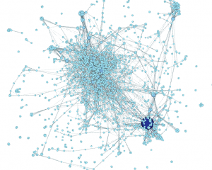
Head to Overview, where you’ll see a blob of nodes:
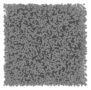
That’s what your topic map looks like right now. Blerg.
Quick note before we move on: if you’re like me, you were afraid to ask this for the longest time: nodes are the circles in the graph (the keywords, here), and edges are the lines between the circles (the connections).
Step 4. Make the graph mean something.
Now, let’s get started! I’ll walk you through how I made the graph, but you should play with all the settings.
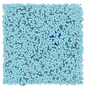
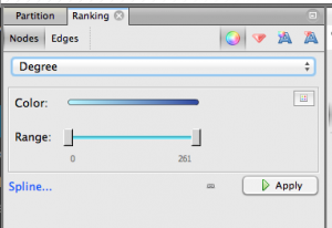
Step 4.1. Give nodes color & size. On the upper left, click Ranking » Nodes and choose Degree as the parameter. You’ll get a chance to select the colors you want to use. Nodes with more edges (that is, popular keywords) will be dark blue with my chosen colors, and nodes with few edges will be light blue. Hit apply.
Next, choose the red diamond icon in the same window. This will determine node size. I chose minimum size of 10, maximum size of 100. Playing with this scale will make popular keywords extremely large, relative to tiny unpopular keywords. Here’s what my graph looks like now; note the big dark blue circle hidden behind other nodes:
Step 4.2. Apply a layout. Look at the window on the lower left for a dropdown menu of different layouts. Here, I like ForceAtlas 2. Choose that and try running it with the default parameters.
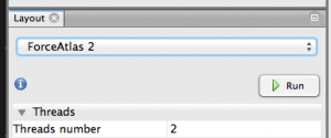
Feel free to shout WHOA! as your nodes appear to explode and move and be animated!! This layout can take a while to run, especially if you have lots of nodes, so you can stop it when you feel like it looks rational.
Curious what ForceAtlas 2 is based on? Its creators wrote a paper in 2011 about this force vector algorithm (aka force-directed). It’s a layout based on readability and aesthetics: connected nodes are drawn closer together, and the graph is arranged to allow for fewer edges to overlap each other.
Step 4.3. Add labels. It’s a pretty graph and all, but you can’t see what each node is! Below the graph, on the right hand side, you’ll see a little upside-down house icon, spotlighted below. Click to pop open the label window.
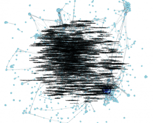
Under the Labels tab, check the box next to Node to see your keywords pop up. It’s kind of a mess:
Step 4.4. Limit the number of nodes. One reason why this graph is so messy is that there are just too many nodes. My graph has 3,600. It’s not very readable or useful — who cares about all the keywords that were only used a couple of times throughout this entire corpus?
To limit the number of nodes, we will use a filter. On the upper right, you’ll see a list of filters. Open the Topology folder and find Degree Range, and drag that into the Queries window.
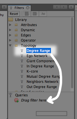
Click it again, and adjust the slider bar down below, then click Filter. Increasing the minimum number of degrees (connections) means that the very unique, unpopular keywords will not be displayed.
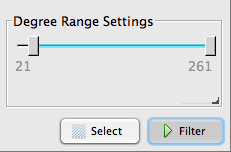
And you’ll see your graph clean up a little. (Note that you can see adjustments ‘in real time’ — you don’t have to click Filter again. It’s a toggle button, so clicking filter again will toggle all your unpopular nodes back into the picture.)
That looks more manageable! Still a little cluttered though.
Step 4.5. Make it readable. There are a few ways to do this using options under Layouts. Try them all.
- Noverlap: prevents overlaps between nodes.
- Label adjust: moves nodes so labels don’t overlap.
- Expansion: explodes the nodes further away from each other. (Note that a scale factor of 1.2 will gently move nodes apart; a scale factor of 0.8 will move them closer together.)
Step 4.6. Clean it up. If, by now, you’re satisfied with how many nodes you have, you might want to delete orphan nodes that aren’t connected to anything else, like this sad little dude in the lower left:
 Pretty sure this also deletes the node from your data (in the Data Laboratory pane, not in the CSV). So choose wisely.
Zoom in and look at the rest of your nodes. If there’s something there that doesn’t tell you much about the topic of the paper, but more about what type of paper it is (‘clinical study’ or ‘humans’), you might consider getting rid of those, too. My graph includes things like crazy protein names, which to me are very mysterious. If this graph is for researchers, leave them, as perhaps those nodes would be informative. If this were for the general public, I’d probably take them out.
Step 4.7. Adjust image preview. Now, you might think at this point that the graph still isn’t that gorgeous. Here’s one weird thing about Gephi. You do all your data-based adjustments in the Overview window, in which you can select and drag individual nodes and set parameters and filters. You do most of the aesthetic work in the Preview window. So head to Preview and click the Refresh button on the lower left corner. Ta-da! Depending on the default settings you had, here’s what you might get:
(Note: I made a few other layout adjustments between the last step and this one, which is why the node clusters have moved around a lot. Usually the Overview and Preview graphs will look roughly similar.)
So: now to make adjustments. Here’s what my Preview Settings window looks like to get the above image:
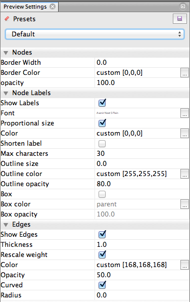 Things to try:
- Curved edges are much more graceful-looking.
- Edges that are not opaque (50% opacity here) are prettier and less overwhelming to look at. Mine are all grey but they could be colorful.
- If you’re choosing that bigger nodes get a bigger font, you might have to select a tiny default font, or risk getting overwhelmed by text. My default font size is 5pt.
- I chose a size 0 (non-existent) border for the nodes. Looks cleaner.
- You may have to return to the Overview pane to expand the graph more. You can also use a larger font there and run Label Adjust to make room for the real labels that are in the Preview pane.
Step 4.8. Export image & try to save Gephi file. Once you’re happy with the generated image, save it as a PDF or PNG. The save option is in the lower left corner. Try a bunch of different layouts and settings, and save all of them as images so that you can pick and choose later.
»»IMPORTANT NOTE ABOUT SAVING .GEPHI FILES.«« I learned this the hard way: there is a common Gephi bug that saved .gephi files may be unopenable later. As one internet forum commenter said, it’s like playing Russian Roulette with the program. If you wanted to open this .gephi file up and make a few small adjustments to the graph later, you might not be able to do it — you might be forced to import the data and start from scratch all over again. The error I get 100% of the time I try to open a .gephi file is “The project file couldn’t be opened. Please check the file has a .gephi extension. XMLStreamException … Premature end of file.” BOOOO. You can export the Gephi file as a .gexf (graph file), so it will at least have your data already included in the file, but it won’t have things like filters or layouts or ranking parameters saved. Oh, well! At least you’ll have your PDFs and PNGs.
Playtime. So, now that you’ve got the basic force-directed topic map down, here’s what else is possible when playing with the same data:
So, as you can see, it’s a bit of a complicated endeavor, to represent anything visually! Be responsible: make sure the graph represents what you know to be generally true about your institution’s publication trends, and accompany your visualization with a text explanation, something along the lines of “This visualization represents the interconnected topics of a sample of scientific papers published by John Jay faculty and graduate students from 1971 to 2014, totaling 800 of the thousands of publications from John Jay-affiliated authors.”
Good luck! Feel free to share your results, questions, tips/tricks, and other ideas with me on twitter (@robincamille).
P.S. Edit June 1, 2015: see different versions of my finished map on the first 3 pages of “50 Years of Research,” a publication from John Jay’s Office for the Advancement of Research! It’s a little grainy on screen, but printed, it’s gorgeous.




Thanks a lot for this very useful tutorial, it is a precious resource!
In Sciences Po Paris we often teach this exact method to our students. We provided them a web page that embeds scripts similar to the Python code you propose. It’s just a more convenient way to do the same thing. You simply need a HTML5 browser (like Google Chrome) to get the network from the Scopus CSV file. Here are these resources:
– On this page you can convert a Scopus CSV file to different networks
– The main page of this tool we call “ScienceScape” offers other similar scripts
– In case you need a more generic way to extract a network from a CSV file, you can use Table 2 Net which is more complicated but more polyvalent (you can choose the precise type of network to extract).
I hope these can be useful to you!
Merci, Mathieu! I remember seeing that Sciences Po page a long time ago — it was my original guide for how to do this! I should have linked to it from the start :) Thank you for making tools to make this task easier!