This blog has moved

I have consolidated my personal blog with this Emerging Tech in Libraries blog, since there’s a lot of overlap. I’ll still be active around the CUNY Academic Commons, but as for blogging, it will be easier for me to see all my writing in one place:

robincamille.com »

All blog posts and comments will remain up here. The posts (but not the comments) have also been migrated to my personal site, which now runs on Jekyll (yay!).

Using Twine for non-linear tutorials

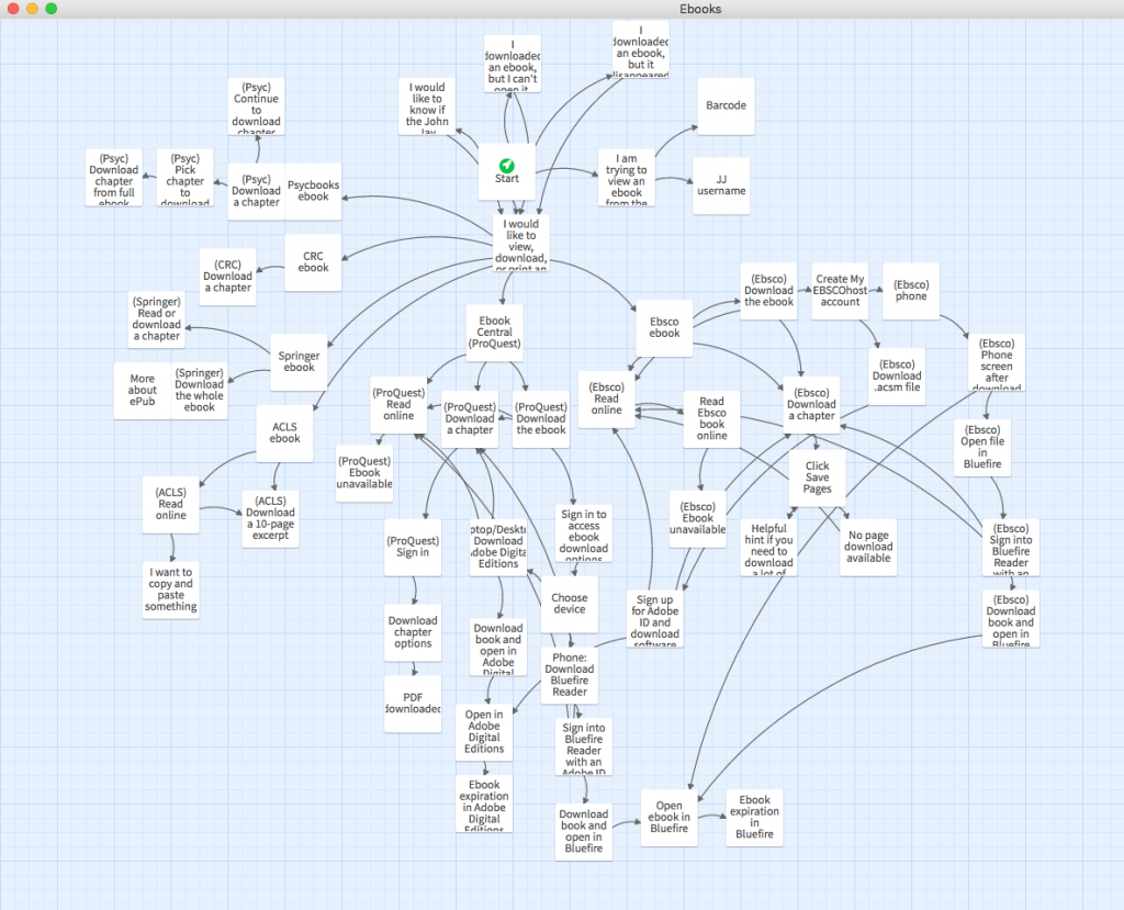
Dozens of steps in a map
Bird’s eye view of my ebooks tutorial

I was first introduced to Twine through Birdland, a delightfully weird bit of e-lit. Its engine, Twine, is designed specially for interactive, nonlinear stories (the choose-your-own-adventure kind).

Turns out Twine is useful for non-literary purposes, too. For some tutorials, it doesn’t make sense to use a linear structure, so Twine is a great tool. Examples of library-related Twine tutorials: choosing a reference manager or how to use the library.

In the library where I work, we get a lot of questions about using ebooks. These questions often come by phone, email, or chat. Patrons are (rightly) frustrated about the overly complicated process to download ebooks. On the phone, reference help usually begins with something like, “Are you seeing the word ‘Ebsco’ in the upper left-hand corner?” But patrons shouldn’t have to learn all about our ebook vendors just to do their reading! Even librarians feel a headache coming on trying to diagnose ebook problems and remember which vendors require an Adobe ID login (ugh). So…

Enter a Twine tutorial about using ebooks!

I found Twine to be a great fit for this, since patrons are dealing with ebooks from different vendors, want to do different things with them, and encounter different problems. From a UX point of view, breaking up a tutorial into click-through steps is so much better than presenting users with a wall of text and expecting them to skim through it to figure out what specifically they need to read.

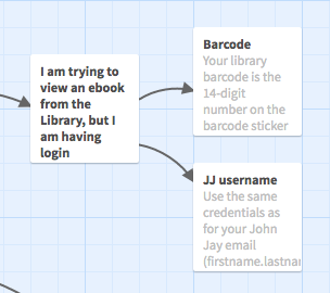
Are you logging in with 1) a barcode or 2) JJ login
View within Twine

The only downside was that I got way too into it and included multiple tasks’ instructions for all of our ebook vendors. It probably took me 10 hours to make this tutorial. Like any web object, it will also require maintenance as time goes on, e.g., updating screenshots when ebook vendors’ UIs change.

I used the downloadable Twine 2 app rather than the web app, so that I didn’t have to worry about accidentally losing my work if I cleared my browser cache. Both output lightweight HTML files with included JavaScript and CSS. (This is especially nice because all the code is bundled into one small file — no need to worry about external JavaScript libraries.)

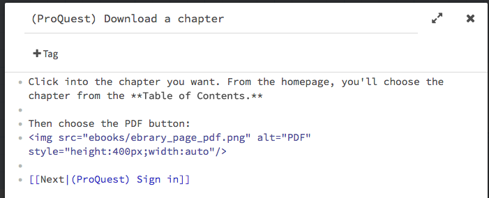
It’s easy and intuitive to get started, especially if you’re already familiar with markup standards like Wiki or Markdown. It also accepts HTML, so you can make external links and include images using HTML tags.

IMG tag (HTML) and double-bracket link (Harlowe)
Harlowe and HTML markup example

Once your tutorial is in a “done” state, just upload the resulting HTML file and any images you used to your webspace.

Note: By default, the page background is black and the text is white, which is hard to read (and not accessible), so if you know a bit of CSS, you can add a custom stylesheet. To change the look of everything, add something like this: tw-story { background:#fff; color:#000; … }.

I can see this particular ebooks tutorial being used as a tool for both patrons and librarians. The feedback from my colleagues has been very positive so far, and we’re already talking about what other topics could be explained with this kind of non-linear instructional material.

What did I do this year? 2016-17 edition

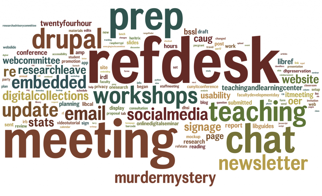
word cloud prominently featuring refdesk, email, prep, chat, teaching, workshops

Every year, I take all of my “Done” tasks in my daily work log, normalize them, and run them through a word cloud visualizer to see what I’ve been spending my time doing. This helps me as I write my annual self-evaluation and generally reflect on how I should spend my time in the coming year. It doesn’t have a lot of nuance, though — things that repeat a lot are bigger, even if they don’t loom large in my head.

This year’s word cloud similar to last year’s in that I spent time on regularly occurring activities, such as staffing the Reference Desk and reference chat, being in meetings, emailing people, and teaching/prepping for teaching.

Things I focused on this year especially

  • researchleave — this was my first year on the tenure track, and I spent about 4 days a month on RL, which is granted to junior faculty members at CUNY. I spent most of that time gathering data for a web preservation survey project, learning new tech skills for use in an NLP project, writing my Internet Connection column, and writing proposals (my PSC-CUNY grant proposal was accepted!).
  • drupal, mockupupdate, usability, and webcommittee — our library website just underwent an interface update 7 months in the making. I chaired the library’s Web Committee, made mock-ups, gathered feedback, designed and moderated usability tests, and implemented UI/UX changes on our Drupal site. I also updated a lot of content and promotional materials on the website, a continuous job.
  • workshops — I’ve come to realize that running workshops is one of my favorite professional activities. Library basics, Python skills, teaching tips — I love it! I ran a handful of workshops this year aimed at students and at faculty, such as my very well-attended “Privacy tips & tools” workshop.
  • socialmedia — it’s extra-big in the cloud because I noted this whenever I made a post, which was more often than before. Several other librarians and I share the Twitter and Facebook accounts; I run our Instagram presence, which I’ve focused on growing. Though spotty over the summer, @johnjaylibrary on Instagram gained 112 new followers, and I created 87 posts over the year. (At first, most of our followers were other libraries. Now they seem to be mostly John Jay students!)
  • oer — I spent a fair amount of time this year reading up on Open Educational Resources, before and after attending OER17 in London.
  • teachingandlearningcenter — I was part of a year-long, very good “Online/digital teaching” seminar at John Jay’s TLC.

Things to do more of next year

In 2017-18, my intention is to use my research leave time better and more productively. I’ve gotten better at time management in the office (see: the rising prominence of “prep” in these annual word clouds), but I need to build up better habits on my own time, too, as I work on my solo projects. This might also point to a need to collaborate more with other scholars/practitioners — I’m at my best and most productive when working on a team.

Looking again at last year’s “What did I do this year?”, I see that I’d intended to carve out more time for reading. I did do some of that during my research leave, but I have to be a lot more intentional about it or I’ll just focus on hands-on activities.

I also plan to spend more time on professional development, such as improving my JavaScript skills and attending/presenting at more conferences. I think I got conference burn-out last year, but now I miss it. Time to jump back in.

To scope or not to scope?

Our library homepage‘s main search area currently looks like this:
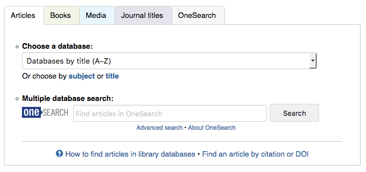
Articles, Books, Media, Journals, OneSearch

The tab box has served us well for years, but it’s about time we upgraded to something simpler and easier to use. We plan to give our entire website a nice update over the summer, mostly subtle aesthetic changes, but with a big search box upgrade. We’re currently in a discussion about whether to keep the general idea of tabs (expecting users, mostly students, to know ahead of time whether they’re looking for articles or books) or to present one big OneSearch box (à la Google).

TL;DR: We plan to present the big-box search that students say they love, but include Article/Book/Media scopes as a didactic hint and visual cue. This post looks at how other libraries present scope options, if any.

Our website analytics tell us that students mostly use the scoped options. In the tab box, the 4 highest-use options, in order: database dropdown menu, OneSearch box scoped to articles, OneSearch box scoped to books, and OneSearch box non-scoped. This is strongly influenced by the options that we present to the user.

Do we keep these scopes in our redesign? Students compose most of our users. On the one hand, they’ll probably say they’d prefer a big search box, like Google and Amazon. On the other hand, when they approach the reference desk, they’ll usually say, “I’m looking for a book called…” or “I need to find articles on…” So what do we do?

Step 1: Let’s see what other libraries are doing.

Search UIs within CUNY

Just about every CUNY defaults to the same discovery layer, OneSearch (aka Primo, the web-scale discovery system from Ex Libris), along with offering a handful of databases and other resources that are campus-specific. OneSearch has the same scope options for every CUNY campus.
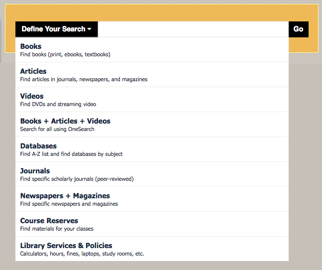
Define Your Search dropdown

The Newman Library at Baruch College requires the user to select a scope first before they can type in the search box. Some of these options are links (like Databases) rather than ways to scope the search.

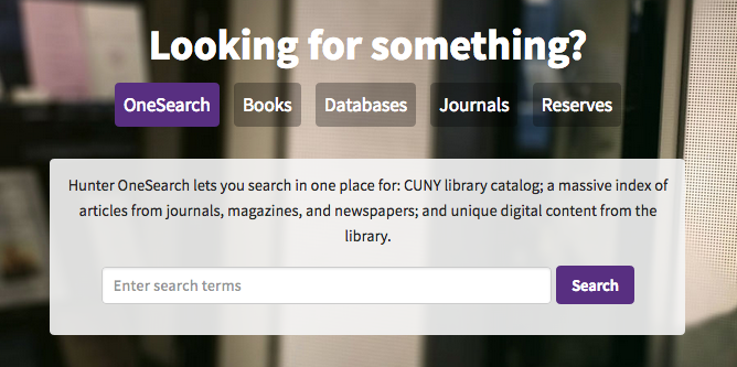
Onesearch, Books, Databases, Journals

Hunter College Libraries default to OneSearch, but offers faded tabs for optional scoping. Media (videos, mostly) isn’t a scope they offer.

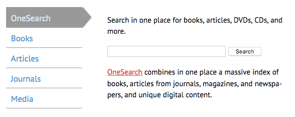
OneSearch, books, articles, journals, media

The College of Staten Island Library does the same as Hunter, but with vertical tabs.

OneSearch - everything, articles, books, books (print only), ebooks, media

The Schwerin Library at City Tech has a dropdown of scopes, but defaults to a non-scoped OneSearch. Interestingly, there are three options for books: print, ebooks, and both. (Here at John Jay, most students seem to prefer print books, so they’d probably appreciate this option.) Databases are linked outside of the tab box.

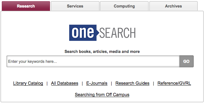
OneSearch - Search books, articles, media and more

Brooklyn College Library offers just one search box, for a non-scoped OneSearch search, but provides text links to CUNY+ and databases below.

In fact, all CUNY libraries’ approaches to OneSearch were tabulated and analyzed by Nora Almeida, Helen Georgas, and Alexandra Hamlett (all CUNY librarians) for their “The Cosmography of Discovery: Integration, Student Perceptions, and Information Design” presentation at the ER&L 2017 Conference. (If you/your institution has an ER&L Conference login, you can watch their presentation slides + audio — highly recommended!)

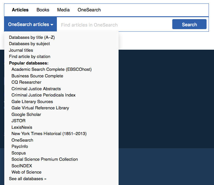
In looking at the above sampling, I also notice that John Jay is an outlier for offering a shortcut list of “popular” databases, rather than directing users to the full list of databases, which can number over 100. This campus is pretty tied to that list of popular databases, and I think it’s a good idea to keep that shortcut. (Even if it might diminish the use of the “non-popular” databases.)

Other interesting search UIs

Outside of CUNY, here are a few of my fave academic library websites:

Articles, Books and media, journals

The University of Illinois—Chicago Library search box is currently the above, but apparently they’ll soon be moving to a “Search Everything” bento-box search UI. (I wonder if it really is “everything”?)

The look of the tab box is very clean and technical, mirroring the look of the UIC site as a whole.

A 2017 Code4Lib article, “Participatory Design Methods for Collaboration and Communication,” by Tara M. Wood and Cate Kompare, goes behind the scenes for the UIC website redesign. It’s a fantastic article.

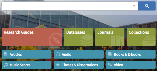
big search box + research guides, databases, journals, articles, etc

The BYU Library has an unlabeled search box for their discovery system (with an advanced search option subtly indicated), and includes lovely buttons below advertising specific resources and majorly highlighting their libguides.

big search

The library at my alma mater, Brown, just has one big search box in the middle of the screen. It’s actually unusual how prominently that box is placed. They’ve put other options below the fold:

search library resources list

Trying a new tab box

So it seems that most other libraries default to an “everything” search, but offer scope options. That seems like it might be a good solution for us, too, but John Jay students are a unique group. What will work for them?

Here at John Jay, I’m now playing with two mocked-up widget boxes. Here’s the first, strongly inspired by UIC:

Three main tabs: OneSearch, Databases, Journal Titles

Defaults to non-scoped OneSearch, as most other CUNYs seem to do, but gives the option for Articles (and peer-reviewed articles), Books, and Media. This, to me, seems like a natural next step: Presenting the big-box search that students say they love, but prominently displaying scope options as a didactic hint and visual cue. This gives the user a hint as to what OneSearch includes. Will students actually use these scopes? We’ll have to test to find out.

One big issue with the “peer-reviewed” checkbox is that OneSearch can only narrow results down to articles published in peer-reviewed journals, but not necessarily peer-reviewed articles, so reviews and columns will show up in the results. We discussed this in our Web Committee, and this is apparently a problem with pretty much all discovery systems, so… Oh, well, we’ll just live with that? I know many students will appreciate this kind of filter, even if it’s problematic. We can use explanatory hover text.

Another issue: “Articles” is distinct from “newspaper articles” as a scope in OneSearch. To sort-of-solve this, I put more explanatory hover text over Articles. (Technically, you can cobble together multiple after-search facets, which Baruch does, but then when the user changes their keywords and searches again, after-search facets disappear, which we didn’t like at John Jay. So we stick to pre-search scopes, which can’t be combined, but do stick around after a keyword revision.)

This tab box includes Databases as a top-level tab:

Databases tab: dropdown menu, Choose by title or subject, Find by citation

Database-specific searching is still how we teach some classes and how many students and faculty alike prefer to search. The tab includes the Popular Dropdown menu, which also directs users to browsing databases by title/subject (duplicating the links below the dropdown menu).

Another tab box I messed around with, more similar to our current one, and inspired by Baruch:

Articles / books / media / OneSearch, simple box

The dropdown menu opens to:Articles, Books, Media, OneSearch

Here, OneSearch is the default search for every tab, and only Articles has any other option. Inspired by Baruch, I faked parts of the dropdown menu — that is, clicking JSTOR won’t present a JSTOR-only search box, it will just open JSTOR as a link.

In a recent Web Committee meeting with other John Jay librarians, we agreed to pursue the first tab box, but perhaps with refinements. Next week, we’ll do some guerrilla usability testing outside the cafeteria so that we can see whether students find the new tab more or less usable. Stay tuned!
OER17 report-back: Four takeaways

OER17 the politics of openI attended the OER17 Conference in London, April 5–6, 2017, with my colleague Ellen Sexton and with support from the Teaching & Learning Center here at John Jay. Though I’m relatively new to the OER (open educational resources) conversation, issues of open access and open knowledge are dear to my heart.

Here are my 4 biggest takeaways from OER17.

Note: the R in OER typically stands for resources, plural, so much of the literature has phrases like “OER have the benefit of…” But that sounds so wacky to my American ears, so I’m just going to go with OERs (plural) and an OER (singular). Most of the time.

What is open? Is “open” actually open?

In the United States, the discussion of OERs is inseparable from the conversation around the sharply rising costs of college textbooks. OERs, like this textbook from OpenStax, are pitched as one solution to this problem, and (in my experience) that’s the bulk of the conversation around OERs. So at OER17, I was surprised and pleased to hear international perspectives on OERs well beyond college textbooks: the general focus was contributing to and reusing public knowledge and public resources. Many sessions centered on Wikipedia and Wikidata, and MOOCs were even mentioned.

The keynote speaker, Maha Bali, opened the conference with important critical questions regarding “open.” Though the intentions of creating open materials may be good, she said, the result can end up reflecting biases and inequities that already exist. Perhaps the biggest example is the clear Anglo-centrism of existing OERs. We must ask ourselves when creating or using OERs: whose content is privileged? What language is it in? Whose culture is reflected? What is being implicitly taught in the “hidden curriculum” (a new term to me)?

Unless we ask ourselves these questions, we will simply reproduce these biases. “Inclusion must be engineered,” Bali quotes Sherri Spelic’s Digital Pedagogy lab post.

Moreover, open ≠ free (or libre). OERs aren’t free to create. They aren’t free to distribute (e.g., all web domains are rented, not owned; plus, IMO, free services aren’t really free). And regarding living “in the open” online, Bali pointed out that we are not equally vulnerable to trolling, harassment, and surveillance.

Maha Bali’s excellent slides and the recording are online.

Read more