At today’s fantastic LACUNY Institute here at John Jay, Anthony Cocciolo (Pratt Institute) gave a very good presentation on “Rebuilding Post-War Europe: New York and Digital Archives as Reconstitutive Fabric.” He asked this striking question: How can digital technology build understanding and compassion between people?
He’s part of the German Traces NYC project team, which created a map of German historical sites that automagically creates a walking tour for you based on where in the city you are now and how long you want to spend walking around. They released the software, GeoStoryteller, both on SourceForge and as a web app in which you can create your own “geostories” and “portals” (collections of geostories). Pretty cool.
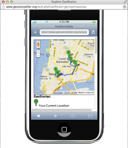 Walking map from downtown, with 1 hour 30 minutes selected as tour time
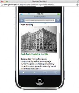 Detail page for one point of interest
I just tried my hand at creating a portal myself. It was pretty easy and very quick, plus it gives you a clickable iPhone preview. At John Jay, we have some pretty gruesome / interesting photos online that are totally georeferenceable. Perhaps a Crime in New York walking tour could happen in the future? Hmm…
I couldn’t find any help pages though, so if you’re going to try out GeoStoryteller…
GeoStoryteller tips
- When creating a portal (collection of sites), you’ll give it a keyword; it should be unique, like politicalhistorynyc.
- When creating a geostory (single site), the only way to associate the geostory to your portal is by pasting that keyword (politicalhistorynyc) into the Keywords field. I don’t know if general keywords like ‘park’ or ‘politics’ do anything.
- Image Icon of Site is what will show up when you tap a geostory (the Park Building in the image above).
- Users will probably only read the description, but there is an option Link to more info by creating a page with much more information that allows for styling, embedded media, and more (or linking to a preexisting one). That’s what the green “Next: Begin Exploring this Site” link on each geostory takes you to.
More about georeferencing
GeoStoryteller works by georeferencing places — assigning latitude/longitude coordinates so the place can be mapped by GIS services like Google Maps or Open Street Maps.
Now that georeferencing is actually useful and usable, I’m seeing more and more digitized primary sources come into our mobile devices from libraries and archives. One of the first big projects was City of Lit from the University of Iowa (web app / mobile app). If you live in a big city, the HistoryPin app is a lot of fun to use. Many libraries and archives are contributing to HistoryPin as channels. Also, Wikipedia uses georeferences on articles (see upper right). One of my favorite ways to explore is by opening up the Articles iPhone app and selecting Nearby. So cool.
It’s always tough to get our historical sources in the public eye, but projects and tools like these expand your potential readership far beyond your walls or even your own website. I myself am of the splatter approach to digital collections. If you scanned it once, get the most bang for your buck by splattering it across the internet in as many venues as possible: your own site, Flickr, Tumblr, Twitter, Facebook, Internet Archive, HistoryPin, etc. This way, you promote your institution, contribute your high-quality materials (with context!) on high-traffic media, and cast a wide net for interested researchers and inspired passersby. Sharing is caring!