Making a Superfish menu faster by removing animation

Superfish menu

I’m posting this because none of the other solutions I found through googling fixed our problem. Context: Superfish is a Drupal module for your nav menu that shows submenus on hover. Also, I don’t really know JavaScript/jQuery very well, just enough to fumble around and get solutions.

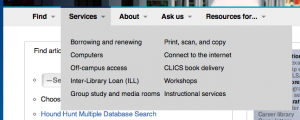
By default, the Superfish submenus fade into view when you hover on the menu’s title, which is usually a link itself. This is dumb. It’s so slow. In 100% of the usability study sessions I conducted with this default menu animation, the users clicked on the menu’s title right away and got annoyed when they saw the submenu begin to appear just as the browser loaded a new page. Ain’t nobody got an extra 400 milliseconds for a submenu! It should appear on hover instantly. Here’s how I disabled the slow animation.

  1. Changed line 118 in superfish. js, which originally looked like this…
    $ul.animate(o.animation,o.speed,function(){ sf.IE7fix.call($ul); o.onShow.call($ul); });
    …to this…
    $ul.show(0,function(){ sf.IE7fix.call($ul); o.onShow.call($ul);});
  2. Then, I went to admin/config/user-interface/superfish (you may have to give yourself the right permissions to configure Superfish) and deleted these files from the “Path to Superfish library” text box:
        jquery.hoverIntent.minified.js
        jquery.bgiframe.min.js

Most of the other solutions out there say to change the delay or speed values to 1 in lines 86-99 of superfish.js, or to set disableHI to false, but none of those solutions worked (although I kept them in the .js out of laziness to change it back).

Note: We’re using Drupal v.7 and Superfish v.7.x-1.9. It’s faster for us to call the jQuery library from Google than from our own server. As of this blog post, you can see our menu in action at the top of our library website.

Other than the default delay in showing submenus on hover, Superfish is awesome.
New toy: Raspberry Pi

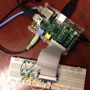
So, first, let me just say that this toy is new only in that it is newly in my possession. I know I’m behind the game by quite a while. When my software engineer dad excitedly told me he’d gotten on the Raspberry Pi waitlist many moons ago, I said “cool” and that was that.

But then I became an Emerging Technologies Librarian almost entirely by accident, through a series of improbable events. I was caught off-guard but am now diving enthusiastically into technologies both emerging and already emerged, including the Raspberry Pi. What’s nice about being late to the game is that others have blazed forth with inspiring projects.

PiAfter perusing the Adafruit Raspberry Pi tutorials, I got so excited that I bought myself the Raspberry Pi starter kit for a hundred bucks. I went through the easy Gmail LED notifier tutorial and am working on getting sound-making buttons operative. Both mini-projects are introducing me to how the RPi works and what the heck a breadboard is even used for and what resistors do. If there’s one thing I’m enjoying, it’s learning how utterly ignorant I am about such non-complexities as press button, make beep sound. Here I should mention that the RPi was originally designed for children.

And what do I plan to do with this? It usually takes me a while to get confident enough with a new skills set, but I hope to find a handful of fun uses within our Library. I’ve got my eye on a Little Printer, particularly after attending a delightful Library APIs workshop.

But first, to master fundamentals. Press button, make beep sound.

Device and browser testing tools

If you’re impatient, like me, you might agree that the worst part of making an online resource is testing the interface across devices and browsers. The golden rule that I tout is that all websites I make should look their best no matter how they are accessed: at any resolution, on any common mobile or desktop device, in all common browsers up to 7(ish) years old.

This is hard. Stupid hard. There are so many little quirks in how different devices/browsers choose to display even run-of-the-mill HTML, CSS, and JavaScript. So you either design super simple interfaces, or you do the legwork and make sure your code checks out across the spectrum. But how do you do that?

You can choose to own many devices (or virtual machines) and maintain a stable of old and new browser versions, which is tough but gives you the best taste of the user’s experience. Serious devs and tech companies usually have quite a collection of devices.

Your other option: you’ll have to rely on emulation software. My favorites:

Testing an Android device (click to enlarge)

BrowserStack — 60(?) minutes of free testing, then $19/mo for individuals thereafter. Test your URLs in a ton of browsers and in the most common desktop/mobile platforms. Their emulator is interactive, so you can click, scroll, and type.

Testing IE8 (click to enlarge)

NetRenderer — old reliable here. Test for free in IE 5.5–10. Paste in a URL and get a screenshot of how it looks on the screen, with the option to offset the screenshot by a number of pixels to peek past the fold.

What device/browser testing tools do you use?

Technical details pages

In the past few years, I have noticed an excellent trend among digital projects: the detailed tech specs page. The spirit of transparency and sharing has moved some project teams to show off their work by listing out how they did what, using which tools. I just made a Technical Details page for the Lloyd Sealy Library website, but it’s rather brief at the moment.

Better examples:

Many projects document their project off-site in journal articles or their blogs, but it’s helpful to your fellow developers to include your tech specs right on-site.

Of course, if there’s a site you like that doesn’t have a technical details page, you can suck out some info about their CMS, analytics software, and more with BuiltWith.

Site icons

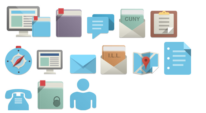
iconsI just made a whole bunch of new icons for our website using the Flat Design Icon sets #1 and #2 from Pixeden. They’re free, royalty-free, and attribution-optional. Each set of 16 icons (including more than the library-oriented ones above) comes bundled in a PSD, so you can change the colors to suit your site. In our case, blue blue, blue. Inspiration? The Flat Design look popularized by Microsoft and Google. 

See them in action on our Resources for Students and Ask us pages.

PS. The phone and person were traced from various wingdings, which is why they’re not quite so nice-looking, but I assigned the same Layer Style to them so they’d match